As the year draws to a close, autumnal tones with an earthy feel are very much in vogue. Khaki is one colour transmitting an organic message and – when combined with other colours such as cognac, black, brown, sage green and water blue – it adds an attractive palate to the home décor. Khaki also has sufficiently dominant gravity to be paired with a brighter colour.
During 2013, fashion catwalks have been embellished with computer-generated prints on fabrics, and these styles are now moving into living room and bedroom interior design.
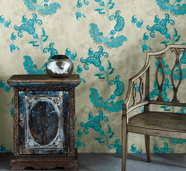
Images above: Wallpapers with a quintessentially English feel… from www.barnebygates.com. Below: Papavero Patch from www.missonihome.it

As a neutral balance, these vibrant flourishes of colours can be paired with softer shades of natural, organic colours.
Teal Blue remains a popular choice, and works well in combination with most other colours. It can also be updated by pairing it with spa blue.
Casamanca “Monaco”… available from www.patriciadarch.com www.patriciadarchinteriors.gi
Bright pinks and orange have been blooming of late but are not many people’s preferred choice for the home. On the other hand, yellow, hailed as the next uplifting colour and the trending leader for 2014, may not create the same reservations.
The key is for it to be neither too strong nor overly light, and to that end it pairs well with grey, taupe and sand.
www.mueblesgavira.es
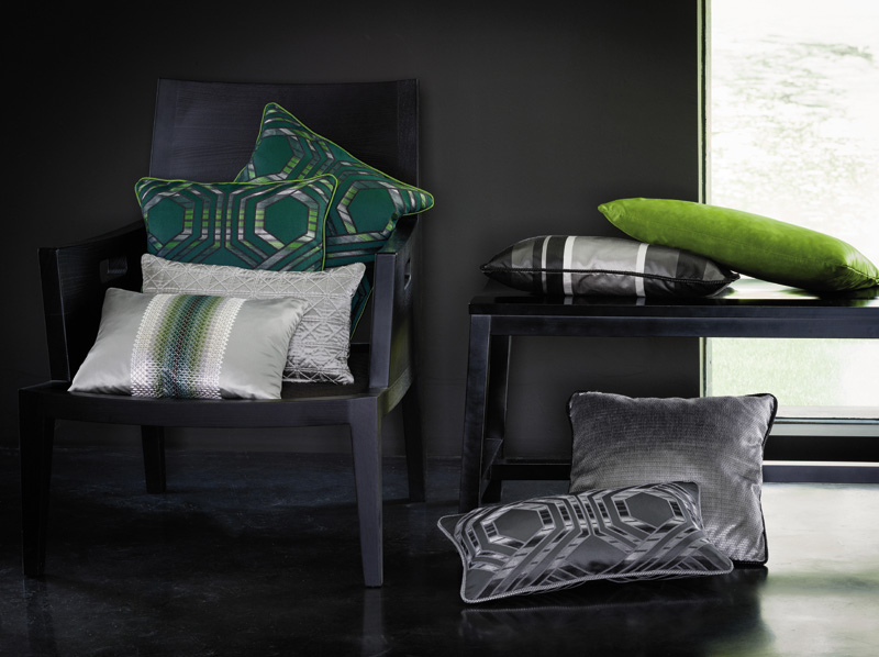
Powerful geometric patterns have been a common feature of both fabric and furniture over the past three years, but in 2014 their dominating lines will be softened and classic floral patterns will replace the angles.
As some of the stronger floral patterns can be a little overwhelming, it is best to ease into bolder prints by combining florals with a white or neutral background. For example, a solid white sofa with floral pillows or a floral-inspired rug.